aboutfaqfeaturesgalleryblogrollcontact

Friday, June 29, 2012

You Is kind Sign

Happy Friday Readers!

We've got another in-house feature for you today.  Laura is a pro sign maker as well as stenciller, and she made this sign for her daughter Mae's bedroom.  The sign is a quote from The Help, by the way.  It's a great movie. 

I wanted to highlight it because she used a particular technique that really looks sharp.


She uses varied coats of paint to create a shadow effect.  All you need to do is reapply the stencil with different color paint and offset by a tiny bit so you can see the layers of paint.  

Now this particular sign uses a font that is outlined to begin with, so there're some serious layers going on.  It gives the text a wonderful depth.  You can see here in the detail picture that the word 'Mommy' is just the two layers of paint with the offset.


Here's a process picture so you can see how applying the second layer of paint goes.  There's really nothing to it.  That big blob on the right side of the picture is just where she has extra paint to work with.


This last picture shows what the breaks look like not filled in in a layered stencil.  Breaks (some stencillers call them islands) are the little bits of plastic that keep cutaways from falling apart in a stencil.  Lots of people never go back and fill in the spots where there isn't any paint from breaks, it's totally personal preference.   It just looks kind of wonky in this particular application.


Mae loved the sign, of course. 

You can check out the "You is Kind" stencil and other subway art stencils here at our store.

That's all we've got for this week.  One birthday party, two one year molars, and one buttercream layer cake later, I am spent!

See you next week!

Wednesday, June 27, 2012

Etspiration Wednesday: Sweet Treats

Hello all!

Sorry for the late post.  It's been a whirlwind day of planning for Maisondestencils workshops (you heard right!), beach going, and birthday cake making (someone near and dear to me is turning 1!)

So in honor of egg, butter, flour, sugar, vanilla, salt, and baking powder here are some deliciously inspiring sweet treats from Etsy.


1A:  Baby Pink Petit Fours Image Courtesy DulceDeLuna
1B:  Cake With Cupcake Stencil Image Courtesy Maisondestencils
1C:  KitchenMade Cake Tin Image Courtesy RandomHallways


2A:  Espresso Hazelnut French Macarons Image Courtesy CarringtonLaneBakery
2B:  Copper Fleur De Lis Cake Pan Image Courtesy WhimsicalVintage
2C:  Sweets Kitchen Towel Set Image Courtesy NolaTawk


3A:  Vintage French Biscuit Tin By Lu Image Courtesy FrenchFollie
3B:  Patisserie 12x12 Stencil Image Courtesy Maisondestencils
3C:  1940s/50s Cake Carrier Image Courtesy AnalogueShop


4A:  Fleur de Lis Chocolate Covered Oreos Image Courtesy Idofavors
4B:  Embossed Cake Base Image Courtesy ANewFoundTreasure
4C:  Bakeshop Stencil Image Courtesy Maisondestencils


5A:  Ceramic Cake Stand Pedestal in Cobalt Blue Image Courtesy TheRocheStudio
5B:  Ginger Snaps Wooden Crate Image Courtesy WdWsDesignTrends
5C:  Cakeshop Stencil Image Courtesy Maisondestencils
5D:  French Tin Biscuit Box Image Courtesy FrenchAccents

Have a sweet evening!

Friday, June 22, 2012

Feature Friday: The Confections Table

Hello all!

We've got an awesome feature today from a great client, Andrea, in Germany.  She and Laura worked together to create a custom stencil which she then applied to a desk table.


Isn't it great!  I just love how large it is!  We've been working more and more in the 12 x 18 size range for our stencils that have a lot of type.  It makes sense when you think about it.  The smaller the stencil, the smaller all those letters are going to be. 


Laura liked the finished product so much on this design she created a few more in the same style.  This is the idea that spun forth the patisserie and boulangerie labels.


I love what Andrea did here on the chair.  She took a few lines of type from the stencil and echoed them back on the top of the chair.  There's no rulebook that says you can only use every element of a stencil once.  Go crazy!  Use phrases as many or few times as you like. 

Andrea has a blog where you can check out all the amazing furniture pieces she's rehabbed.  You can check it out here.  I've been combing through it this week prepping for this feature and I have to say, I am more than a little bit jealous that she gets to go to all the markets in Paris and look for vintage treasures. 

You can also like her on Facebook at Vintage Inspirations

Like I mentioned above, this was a custom stencil.  But you can check out our other label stencils here

In other news, we were just featured on a wonderful blog called Cozy Little House.  Thanks so much for the welcome wagon!  Everyone in the blogosphere (is it still hip to say that?) has been so friendly and helpful.

Hope you all have a wonderful weekend.  Here in Astoria, it's Scandinavian Festival weekend (We have a very rich Scandinavian heritage) so it's time for my little Viking and I to check out the folk dancers, have some aebelskiver, and hopefully not any lutefisk.


Wednesday, June 20, 2012

Etspiration Wednesday: The Opera

Hi all, happy Wednesday!

I finished a great book recently and thought I'd give it a mention.  It's called Bel Canto and it's written by Ann Patchett.  In a nutshell, it takes place in a South American country and concerns the birthday party of a wealthy Japanese executive who is an opera devotee.  A famous soprano is scheduled to perform at the event, but a rebel faction takes all the party goers hostage, including the soprano.  The standoff is lengthy, and people on both sides of the hostage line form lasting bonds.

I love reading books about which I know nothing, and here that includes pretty much everything, including opera.  I think prior to reading it, my only exposure to opera was that Bugs Bunny cartoon based off the Barber of Seville.

It's so beautiful though.  And universal.  It doesn't matter if we're listening in Italian or French, just the sound of opera is poetic.  I've come to discover that the look of opera is pure poetry as well.  While doing this etspiration, I became rather obsessed with opera librettos (the programs that explain what the heck everyone is singing about).  Take a look at some nifty opera themed items I found this week.


1A:  Lucky Folding Opera Glasses Image Courtesy TheVintageDogHouse
1B:  Piero Fornasetti Opera Coasters Image Courtesy EyePopVintage
1C:  Serenade Me Music Pillow Image Courtesy WordGarden
1D:  Opera Stencil Image Courtesy Maisondestencils

These opera glasses are just the coolest.  I love the box as well. 


2A:  Vintage Metropolitan Opera Libretto Image Courtesy ChesapeakeVintage
2B:  Three Opera Composer Busts Image Courtesy StevesStoreOfStuff
2C:  French Opera Theatre Image Courtesy BurlapLuxe

You really do need to click on the link for 2C to get the full effect.  It's a child's toy.  Apparently, it was la mode in the late 19th France to stage tiny operas with dolls in these amazing little theatres.  I don't know about you all, but I had lincoln logs. 


3A:  Tall Stack of Music, Opera, and Ballet Books Image Courtesy BeJoyfulVintage
3B:  Cast Iron Singer Sign Image Courtesy Luckyjunk
3C:  Opera With Crown And Address Stencil Image Courtesy Maisondestencils
3D:  Portuguese Opera Program Booklet Image Courtesy PetiteBrocante

The libretto in 3D is amazing.  It's a little slice of Art Nouveau brilliance.  I love the type, love the color choice, love everything about it.


4A:  Civic Opera House Program Image Courtesy DitzyDarlings
4B:  La Boheme Poster Magnet Image Courtesy LabelStone
4C:  Opera Poster Fabric Panel Image Courtesy FleaMarketTrixie
4D:  Opera Municipal Marseille Address Stencil Image Courtesy Maisondestencils

LabelStone takes vintage fruit labels and posters and makes magnets out of them.  This La Boheme poster is really terrific.  The composition is just great. 

Thanks to all our lovely Etsy Sellers for use of their photos.

Have you been reading any good books lately?  I am always on the lookout for a great new read!  Drop us a comment!

See you Friday.  We've got a fab German feature for you all.

Saturday, June 16, 2012

Super Saturday News!

Hi there!

Some exciting tidbits for you.  You may have noticed if you browsed the Maisondestencils store recently that things are looking very different.

That's because they are!  We've completely redesigned our store for a better shopping experience.  We hope you like it, we certainly do.

In addition to a super slick new store website, you can also browse and shop our store on our Facebook page!  Our Facebook page also looks radically different, but that's because Laura and I are Facebook noobs and it took us forever to realize the difference between the business and personal pages. 

If you're at all curious, we are using the e-commerce vendor Goodsie and they are amazing.  So easy to use, no limit to item numbers, very flexible design styles, and the sites look stunning.  We've used several e-commerce vendors in the past and the websites always look incredibly generic.  So rah rah Goodsie!  Plus, adding the store to Facebook took two button clicks.  How nice is that?

(Disclaimer:  Goodsie did not pay me any money to say all this nice stuff, I am just eternally grateful for an e-commerce provider that is not awful.)


So if you haven't already, be sure and like us on Facebook and check out the new store!

Have a lovely weekend!

Friday, June 15, 2012

Feature Friday: Green Mountain BoHo Tea Towels

Happy Friday! We've got another splendid feature from Cindy at Green Mountain BoHo! She's been making tea towels with some of our most popular designs. Check them out!


 Among the 9 million resolutions I made this New Year's, one of them was to create less paper waste.  So I am a towel fanatic and a firm believer in the fact that you can never have too many kitchen towels.  Also, I have a baby.  In other words, constant mess!  These are perfect. 


Here's two more she did.  One is Lucas Moller, who is a frequent flyer here on Maisondestencils.  The other is Chateau Chambord, which has not yet been featured on the blog.  Aren't these pretty?  I'd almost feel bad mopping up something with them!


Cindy has an Etsy store you can check out here where all these tea towels are available for sale.  She also has a facebook page you can check out.

If you'd like to check out the stencils used, click the following links:

Paris No 13
Bee with Laurel Wreath
Chateau de Cheverny
Lucas Moller
Chateau de Chambord

Our thanks to Cindy at Green Mountain Boho for use of her images.  If you'd like to have an item you created with Maisondestencils' stencil featured on our website, drop me a line here.  I'd love to feature you!

Be sure and check back tomorrow, we have a big news post rolling out with some exciting new features!

Wednesday, June 13, 2012

Etspiration Wednesday: Chalk Paint

I can't believe we've had this blog for three months and haven't done an Etspiration about Chalk Paint.  Now I know 99% of you just nodded your head in agreement.  For the 1% of you who asked, "What is Chalk Paint?"  I will briefly explain that Chalk Paint is goodness in a can.  You can check out the official website here, but the short version is that it's a specially formulated paint which you can thin with water to use as a wash or thicken to apply as an impasto.  It is remarkably flexible and lends itself especially well to mimicking the look of aged items.  It gives paint the perfect patina.  So that drab oak table you found at a garage sale can end up looking like it was sitting in some Paris apartment holding a classy Mademoiselle's teacup.

A few of our Feature Friday items have been crafted using Chalk Paint, including The Schoolhouse Cabinet and The Feedsack Stripe Table.  We're always on the lookout for other great features.  If you'd ever like your stencil project showcased on the blog, just drop us an email.

Here's a small sampling of some great items on Etsy that are finished using Chalk Paint.


1A:  Victorian Pedestal Rocker Image Courtesy JunkDrawerDivas
1B:  Farmhouse Country Cottage Pantry Server Image Courtesy StiltskinStudios
1C:  Duck Egg Blue Pedestal Cloche Image Courtesy ShabbyDecor
1D:  Nest With Graphic Stencil Image Courtesy Maisondestencils

The Pantry Server in 1B is really terrific.  You've got to visit the Etsy page for a better look.  My tiny picture does not do it justice. 


2A:  Peacock Stencil Image Courtesy Maisondestencils
2B:  French Provincial Drum Table Image Courtesy Seases
2C:  Instant Wall Collection Turquoise Image Courtesy LoriAndTheLittleBird
2D: Hand Painted Yellow Mirror Image Courtesy SummerWindInteriors

That yellow mirror is truly stunning.  SummerWindInteriors also has it in aqua, which I love.  One of my favorite colors.


3A:  Antiques Stencil Image Courtesy Maisondestencils
3B:  Cottage Chic Roll Top Desk Image Courtesy ArtByJuliet
3C:  Yellow  Curved Leg Foot Stool Image Courtesy cabinintheheartland
3D:  Aqua and Yellow Cane Jewelry Chest Image Courtesy MagiaMia

I love the idea of a roll top desk.  I've got an iMac, so I'm sadly constrained to having a computer armoire due to space requirements.  I love that both the roll top and armoire concepts allow you shut away computer mess.  This roll top desk is something special though.  Check out how ArtByJuliet echoed the diamond shape from the shelf bracket in the stencil pattern on the sides.  It's a work of art.


4A:  Primitive Wooden Kitchen Shelf Image Courtesy Sienaslew
4B:  Decorative Shabby Floral Box Image Courtesy GroveRoots
4C:  Handpainted Corbel Shaped Sconces Image Courtesy DaphsSmallWorld
4D:  Bed & Breakfast Stencil Image Courtesy Maisondestencils

These sconces (4C) are just too great.  I can see them holding candles or very small sculpture in a room with classical details.

Thanks to our Chalkrific Etsy sellers for use of their images.  See you on Friday for a fabulous stencil feature!

Friday, June 8, 2012

Feature Friday: The Notting Hill Pillow

We have a Brit-tastic feature for you today courtesy of Lisa @ Pickles and Cheese.  She took our popular Notting Hill stencil and made a terrific pillow out of it.


Doesn't it look great?  I don't know if it's the Diamond Jubilee or the royal wedding, but I just can't get enough of the British stuff this year.   

Lisa actually made the cushion covers out of painter's cloth, which is a great way to get a lot of cloth for not a lot of money.  Painter's cloth also has a nice look and feel if you are going for sort of a rustic decor. 


Great tip:  She slid a magazine inside the cushion cover to ensure the paint didn't bleed through to the other side. 


Notice how the stencil has paint overlap outside of the cutaways?  This is a good thing!  The number one mistake stencillers make is applying too much paint.  That can cause the paint to seep through into other areas.  No good!  For best results, start by applying your stencil brush in an up/down motion outside of the actual opening you're going to put paint through.  Does that make sense?  It's okay if the stencil gets paint on it!  That way, when you're using that stippling motion, you can just move your hand into the cutaway to apply the paint gradually. 


Here's the Notting Hill pillow hanging out with its friends.  That Wicked pillow is great too!

Check out the original blost post on Pickles and Cheese about the Notting Hill pillow.
Lisa also has a tutorial on how she made the painter's cloth cushion covers.

If you'd like to check out the Notting Hill stencil, click here.

Thanks a bunch to Pickles and Cheese for photo usage.  Her blog is really great, I highly suggest you check it out!


Thursday, June 7, 2012

Typography Giveaway Winner!

We have a winner for our typography giveaway!

Congratulations Deborah Fisk!  Check your email for fabulous prize winning instructions.

Thanks to all for your terrific comments.  We love doing these giveaways periodically, so don't forget to check the blog and your email for future opportunities.

Stay tuned tomorrow for a great Feature Friday!

Wednesday, June 6, 2012

Etspiration Wednesday: Our Friend The Chicken.

The noble chicken.  Always delicious, always a mainstay of home decor.  Chickens were king through the primitive craze.  They dominate in farmhouse kitchens.  They even have a sizable place in French Country decor.  Why do we love them so much?  They aren't smart.  They're kind of dirty.  (Really, they take dirt baths.)  They aren't that cute.  Have you ever really looked at a chicken's face up close?  Yikes! 

I think the reason chickens are so prevalent in decor is because they are ingrained in our culture.  Hear me out as I go all art history on you.  Chickens are far and away the most ubiquitous farm animal.  In a simpler time when subsistence farming was a way of life, having chickens was almost essential.  So packaging and dry goods and all sorts of printed matter reflected this... chickeny existence.  Egg carton, put a chicken on it.  Grainsack, put a chicken on it.  Fruit labels, put roosters on them.  (Sometimes the correlations aren't even clear!) 

Now modern design trends look and borrow heavily from these past traditions.  Where does that leave us?  With chickens.  Chickens on pillows.  Chickens on tote bags.  Roosters on coffee bags.   

For what it's worth, I love them.  We eat a lot of eggs here at the Maison and I'm sure my husband is sick of me asking him to build a chicken coop.  One day!  So in praise of our feathered friends, here's a chicken tour of Etsy.


1A:  Bantam Rooster Pillow Image Courtesy PluckyKid
1B:  Wooden Chicken Wire Cabinet Image Courtesy MozTreasures
1C:  Vintage Rustic Egg Basket Image Courtesy UptownVintage
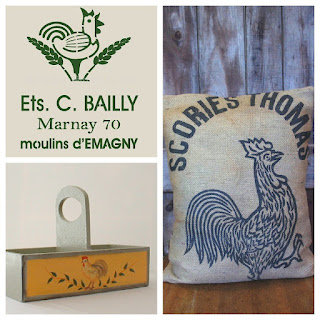
1D:  Ets. C. Bailly 2 Stencil Image Courtesy Maisondestencils

I think the possibilities for that Chicken Wire Cabinet are endless in a kitchen.  Pie safe?  Curio cabinet?  Trinket pantry?  Who knows?  I love it!


2A:  Robins Egg Blue Chicken Pillow Image Courtesy Squirrelonaledgetop
2B:  Poulet Pillow Image Courtesy TheNestUK
2C:  Antique Chicken Wood Molds Image Courtesy NachoKitty

I'm pretty much in love with these chicken molds.  They are the real deal, you can just see the age on them.  And they're all together, which is exceedingly rare for something that's been around the block like those have.  If you visit the listing page, NachoKitty talks about the design process these paper mache molds were used for.  It's really interesting!


3A:  Ets. C. Bailly Stencil Image Courtesy Maisondestencils

3B:  Rooster Divided Caddy Image Courtesy L2Country
3C:  French Rooster Burlap Sack Pillow Image Courtesy PinkPig

Love this burlap rooster pillow.  Great, great graphic image.  I love how bold all those old feedsacks were.


4A:  Fresh Eggs Wood Sign Image Courtesy FYHeartWoodworking
4B:  Vintage Chicken Antique Painted Sign Image Courtesy ZekesAntiques
4C:  Le Coq French Rooster Stencil Image Courtesy Maisondestencils


You've got to check out ZekesAntiques.  He does faux antique painting and it's amazing stuff.  They have the feel of old advertisements and folk art. 


Don't forget, our typography giveaway ends tomorrow.  Comment to win!

Friday, June 1, 2012

Feature Friday: French Book Cart

We have a very elegant feature for you today.  Blogger Little Miss Maggie shares this amazing book cart she transformed from a seriously uninspiring garage sale find.  First the finished product.


I love that this piece is black!  We see a lot of pastels here on Maisondestencils.  Don't get me wrong, they're great, but there is something timeless and classy about black.  Here's a before picture so you can see just how big a transformation this little piece of furniture made.


Super awesome Grateful Dead stickers at the bottom.  Not!  Maggie started by sending those stickers back to Jerry Garcia and then painted the whole piece Canyon Black from the Rustoleum American Accents line.


Her next step was stenciling our popular Hotel De L'Avenir stencil using acrylic ivory paint.   For a more aged look, Maggie hand painted with raw umber on top of the stencil to give a varied, uneven tone to the letters and line work.


Hotel De L'Avenir is a big stencil (12x18) and didn't completely fit on the cart.  So she used the extra text to jazz up the sides of the shelves.  Great idea!

It's always good to remember that you are not married to what we put on a stencil.  You can use as much or little of it for a stenciling project as suits your need.  But we're happy to do customs if you do need something wild and crazy.  :)


She finished up the cart by sanding and sealing with Valspar Clear Flat Spray.  It looks fabulous!

You can check out Little Miss Maggie's original blog post here.  Her whole blog is terrific, do check it out.  You can also check out the Hotel De L'Avenir stencil in our Feedsack category.

Thanks so much to Maggie for the feature this week.  Don't forget, if you've got a stenciling project you'd like featured, we're only an email away.